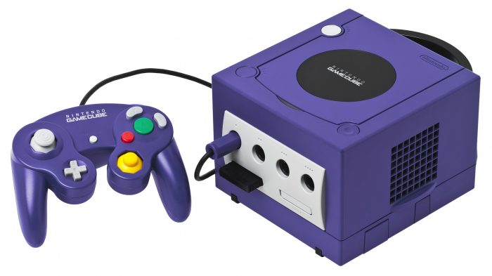
I knew that something was up when I started to enjoy using a GameCube controller. It’s this weird purple shape with a yellow nipple, weirdly shaped buttons, these massive grey plastic triggers; it’s just ugly. It’s horrible. Google it. I don’t know how or why anyone could design it like that. If we’re talking abstract, it’s as close to modern art as a controller will ever get. And yet, despite all of that, it feels amazing to use. It just sits perfectly in my hands and every button is exactly where it needs to be. It might not look pretty, but it gets the job done incredibly.
What’s clear is that controller design isn’t the most logical process. What looks good probably won’t play well, and what looks like it plays well definitely won’t play well. So, obviously, when controller designers got started out, shit got weird. You won’t believe what they came up with just to play Pong.
Imagine the absolute joy of consumers in 1982, when, after shelling out the equivalent of £600 on an Atari 5200, they received something that looked more like a phone than a controller. This, as you will see in the conveniently placed image to your right, was an ugly rectangle with far too many buttons on it. Controllers in the early onset of home video game consoles mostly looked like this: big useless joystick, loads of annoying tiny buttons.
Until the magical year of 1985, when one japanese company decided to make a controller that actually made a tiny bit of sense: good old Nintendo. The NES controller was, well, pretty decent! The introduction of the D-pad (a pad with four directional inputs), although incredibly standard now, was a huge innovation, and set a standard that literally every other console manufacturer copied. SEGA followed with the Master System controller: literally the exact same thing but black. Then Nintendo refined the design slightly with the SNES, and SEGA copied them again. And then Playstation copied them and added some little handles on the bottom. So far, so good. We’re in pretty happy territory.
Now, I don’t know what it was about the 2000s that made everyone lose their collective minds, but something about that decade rolling around really shook the design team about. Nintendo especially just went a bit insane. Firstly, they unveiled the Nintendo 64, with its distinctive three pronged controller. This was just silly. Pop quiz: how many hands do humans have? Answer: not fucking three. This controller, whilst revolutionary in its introduction of the now-standard analogue stick, didn’t allow you to use the analogue stick and the d-pad at the same time, which is frankly an oversight I cannot even process. Then, the aforementioned GameCube, which, apart from its incredible lineup of games, was a failure on all fronts. Maybe time for a bit of a rethink.

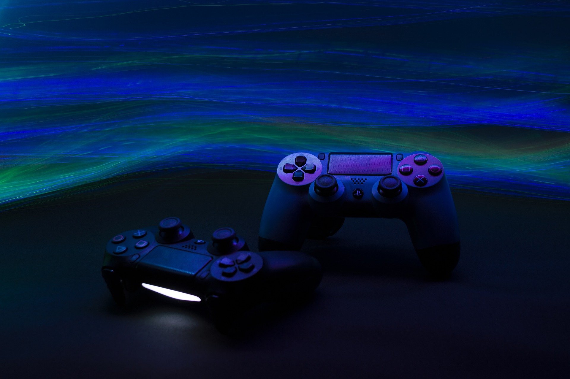
Xbox and Playstation were beginning to normalise controller design, and stuck to a pretty standard combination of joysticks, buttons, and triggers that we’re still basically using today. This was the point for Nintendo to stop messing around and produce a capable console, and reclaim the market dominance that they had in the 80s and 90s.
But, no. Nintendo was still off smoking crack in the corner. When faced with increasing pressure towards fancier graphics, bigger processors, and more complex controllers, they took an absolute trust fall, and found themselves in the wild and untethered world of motion control with the Wii, and its plain rectangular Wiimote. It should’ve crashed and burned. What’s incredible is that it went on to be one of the best selling consoles ever.
The Wiimote was not designed to be cradled and pressed. Not even slightly. It was designed to be waggled. The Wii broke down barriers of entry to consumer games, discarding the strange, abstract control schemes of the Playstations and Xboxes of the world, and instead opted for complete simplicity.
You’ve got a guy on screen holding a sword. You’re holding a stick. Swing the stick, swing the sword. Even Grandma can play this one! The Wii went on to achieve absolutely massive sales numbers. Obviously, other companies soon began to catch on. Sony looked at the Wiimote and thought it was not nearly phallic enough, which prompted their pretty ill-fated Playstation Move. Xbox chose to get rid of the controller altogether, and introduced the Kinect, a strange little camera system that let you use your body as the controller… in theory. In practice, it was cool, and worked… for about 5 minutes before it inevitably asked you to recalibrate or just gave up entirely.
This was also the age of gimmick controllers, where these corporations tried desperately to sell you more useless hunks of plastic that you’d inevitably only play with for a couple of hours. There was the Wii Balance Board, which made reminding yourself of how unfit you are fun, and there were the dance mats, which made reminding yourself of how unfit you are even more fun. A couple of companies hopped on the trend of the whole Guitar Hero/Band Hero thing, and made these cheap plastic imitations of guitars and drums and all that, with garish plasticky buttons, and a little thing that you waggled in the middle to imitate strumming. Safe to say, they also had their time.
It’s strange that we’ve arrived where we have with controllers. Aesthetically, they make almost no sense, and functionally, only slightly more. But until we reach the day that we’re wearing haptic gloves and physically shaking Chris Pratt’s Mario’s hand in real life, we’re stuck with them.
